Rss

Archives for : cover

Summer 2014 Cover From the Matt Cranford Collection

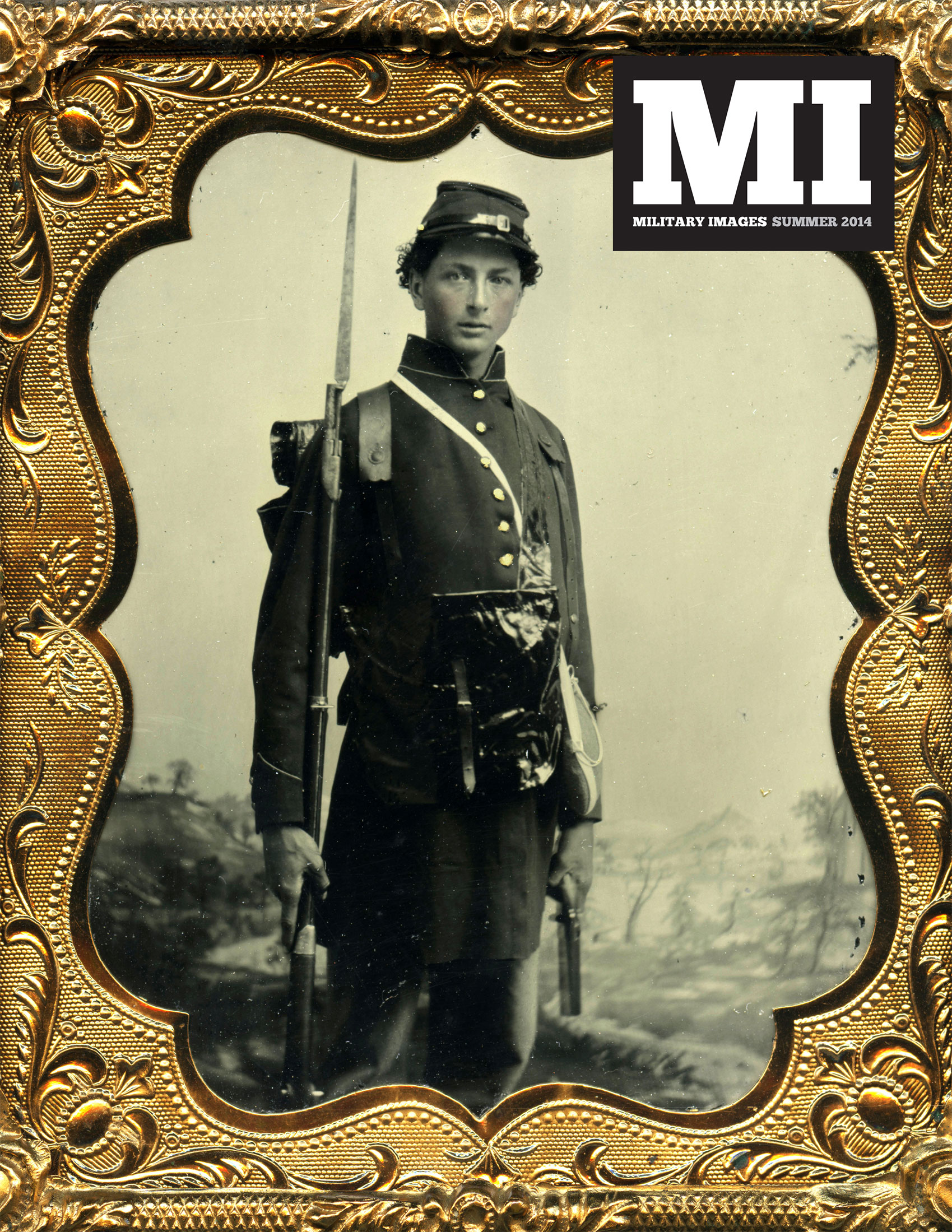
Delighted to share the cover image for the summer issue of MI, which will be mailed next week. This sixth-plate ruby glass ambrotype by an anonymous photographer is from the exquisite collection of Matt Cranford. Representative images from his holdings are highlighted in a feature gallery.

mi-cover-32-3-summer-2014

Here’s the caption that accompanies the cover image:
A clean-shaven young infantryman is equipped with all the trappings of war. He holds a Model 1816 conversion musket with fixed bayonet in one hand, and grips a single shot percussion pistol in the other. A regulation rubberized canvas backpack with russet leather straps and bedroll is strapped to his back, and hanging from his neck is a black-painted leather haversack and drum canteen. “What’s really striking is the backdrop: A very subtle, low-lying landscape that makes the soldier appear as if he’s marching in high country,” Cranford declares.

Spring 2014 Cover Unveiled

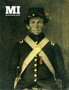
mi-cover-32-2-spring-2014

Delighted to share the cover art for the next issue of Military Images. Special thanks to Rick Brown—This image is from his wonderful collection, which is featured prominently in this issue.

MI is scheduled to be printed next week.

If you’re not a subscriber, now is a great time. Sign up today for a one year subscription and receive 4 quarterly issues—plus a fifth issue free!

Prototype for the Cover Redesign

Cover prototypeIn reviewing various magazine-related materials yesterday, I came across this phrase, “By photo collectors for photo collectors.” It caused me to reflect upon the essential strength of Military Images: The contributors who bring forth superb examples of nineteenth and early twentieth century photographs of soldiers and sailors, and the subscribers, many collectors themselves, who appreciate the quality and subject matter. It is this relationship that drives the magazine.

MI should have a design that recognizes this relationship, and meets the demanding aesthetics and sensibilities of contributors and subscribers. This includes a full-color cover—a first for the magazine, and long overdue. I spent some time last night working with the new logo and a few images from my collection.

In the end, I came up with the prototype shown here. The logo is in the upper left, but can be moved the the upper right depending upon the contents of each cover photo. I modified the logo slightly to accommodate the issue date, which is located just below the “I” in “MI.” In this example, the black box behind the “MI” has been removed because of the darkness of the background. If the background happened to be light, the black box would be added. I also decided not to display any headlines or other text that might take away from the power of the portrait. This follows the traditional look of the magazine, although there have been past issues that do include headlines and other promotional material. The headline-free design also recognizes the collector-subscriber relationship at the heart of the publication.