 In reviewing various magazine-related materials yesterday, I came across this phrase, “By photo collectors for photo collectors.” It caused me to reflect upon the essential strength of Military Images: The contributors who bring forth superb examples of nineteenth and early twentieth century photographs of soldiers and sailors, and the subscribers, many collectors themselves, who appreciate the quality and subject matter. It is this relationship that drives the magazine.
MI should have a design that recognizes this relationship, and meets the demanding aesthetics and sensibilities of contributors and subscribers. This includes a full-color cover—a first for the magazine, and long overdue. I spent some time last night working with the new logo and a few images from my collection.
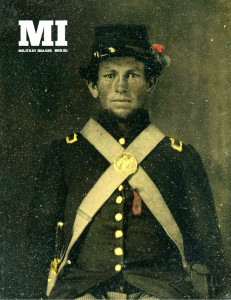
In the end, I came up with the prototype shown here. The logo is in the upper left, but can be moved the the upper right depending upon the contents of each cover photo. I modified the logo slightly to accommodate the issue date, which is located just below the “I” in “MI.” In this example, the black box behind the “MI” has been removed because of the darkness of the background. If the background happened to be light, the black box would be added. I also decided not to display any headlines or other text that might take away from the power of the portrait. This follows the traditional look of the magazine, although there have been past issues that do include headlines and other promotional material. The headline-free design also recognizes the collector-subscriber relationship at the heart of the publication.


