Rss

Archives for : Magazine design

MI’s New Look Extends to Renewal Form

renewalThe redesign that debuted with the current issue of the magazine has impacted all other materials associated with the publication. This includes the renewal form, which is being mailed today to those who have expired subscriptions.

The renewal form is a challenge from a design perspective. There are a number of details to communicate, and clarity is essential. Before beginning the task, I prepared by collecting renewal forms and invitations to subscribe forms from other publications.

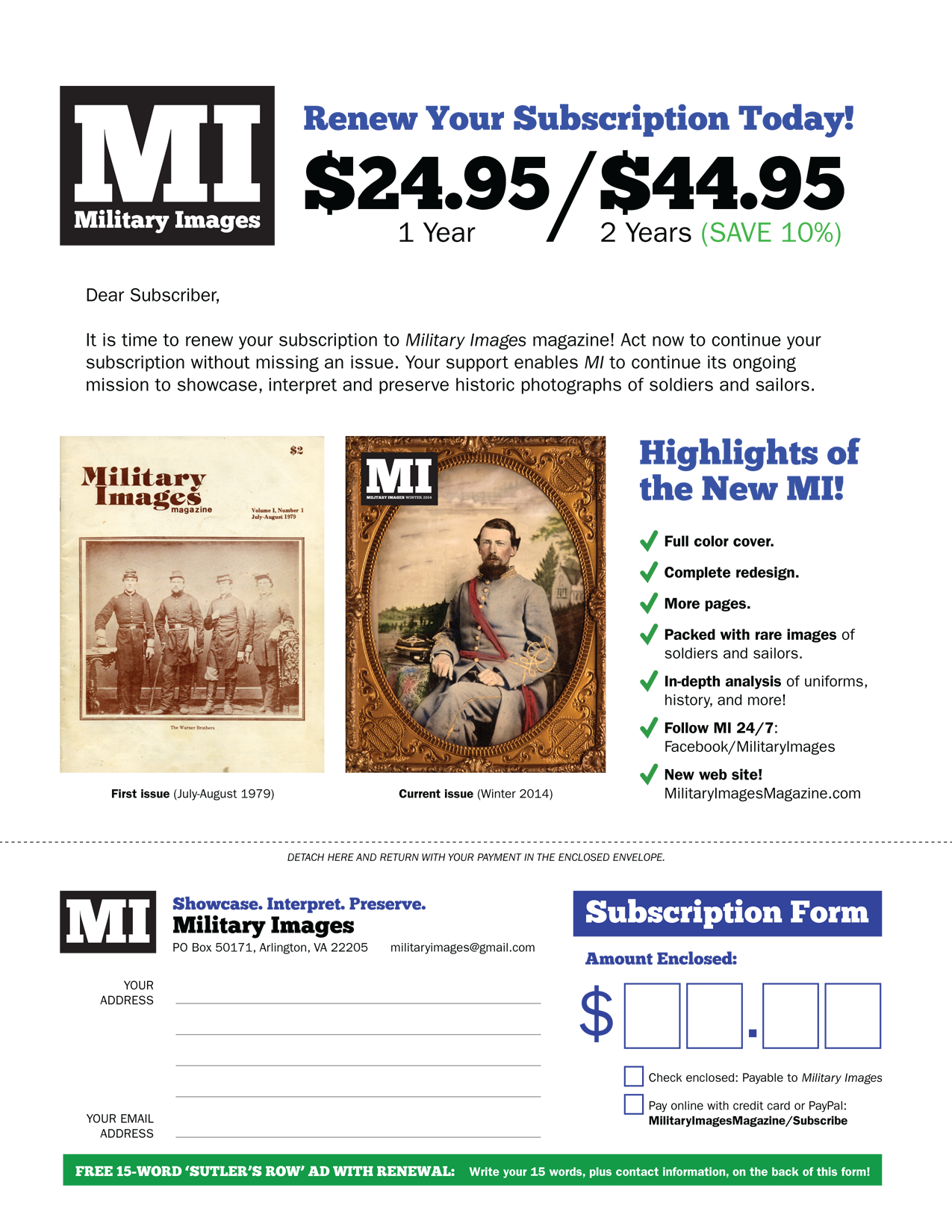
Armed with samples, I set about creating the new form shown here. The final version is divided into two sections. The upper two-thirds states the price and describes highlights of the new MI, which includes the redesigned magazine and web site. The bottom third is a detachable return slip which is returned with payment in a self-addressed stamped envelope included with the form.

The biggest change, aside from the new look, is the placement of the free (and optional) classified ad, a long-time tradition for renewing subscribers. The free ad is still available, but the large space on the front of the return slip to enter the ten words and contact information has been reduced to a green box at the very bottom of the form. Text in the green box instructs subscribers to use the back of the return slip to enter this information. They can also email militaryimages@gmail.com.

The Winter 2014 Issue Is Ready to Go to Press!

One of the editorial highlights of any publication is the moment you decide it is ready to go to press. The moment comes after weeks and months of planning, and a final few frenetic days of proofing pages, editing text and tweaking the design.

mi-editsThe ‘Moment’ for Military Images arrived last night when I put my red pen down, confident that the Winter 2014 issue (my first as editor and publisher) was completed.

And while my description may make it seem a solitary journey, it was anything but a lonesome adventure. My wife Anne has been great in every way, and her honest feedback along the way truly appreciated. Copy Editor Jack Hurov has been terrific. His work has sharpened the text and put MI on the path of a solid style guide that will be very useful for future issues. I am indebted to Senior Editor Mike McAfee for his great column, “Uniforms & History,” and for the number of times over the last few months that I’ve emailed him images with a request for his authoritative opinion, which he always gave quickly and decisively.

So many other friends of MI have rallied to support our efforts, and I’ve been overwhelmed with their generosity. Contributing Editors Ron Field, Steve Karnes, Scott Valentine and David W. Vaughan contacted me early on and shared their contributions and observations. They were not alone! Other contributors in this issue include Rick Carlile, David Cress, Shayne Davidson, Francis Guber, Janet & Bedford Hayes, Don Hopkins, Mike Hunt, Rich Jahn, Tom Liljenquist, Greg Mast, John Robella, Gary and Bill Stier, Bryan Watson and Buck Zaidel.

In the end, it is your passion, enthusiasm and energy that keeps MI alive. This thought is foremost in my mind this morning.

The work of course is not complete! Today, I’ll make pdfs of the pages and shipped them via DropBox to the printer. And planning is already underway for the Spring 2014 issue and beyond!

Prototype for the Cover Redesign

Cover prototypeIn reviewing various magazine-related materials yesterday, I came across this phrase, “By photo collectors for photo collectors.” It caused me to reflect upon the essential strength of Military Images: The contributors who bring forth superb examples of nineteenth and early twentieth century photographs of soldiers and sailors, and the subscribers, many collectors themselves, who appreciate the quality and subject matter. It is this relationship that drives the magazine.

MI should have a design that recognizes this relationship, and meets the demanding aesthetics and sensibilities of contributors and subscribers. This includes a full-color cover—a first for the magazine, and long overdue. I spent some time last night working with the new logo and a few images from my collection.

In the end, I came up with the prototype shown here. The logo is in the upper left, but can be moved the the upper right depending upon the contents of each cover photo. I modified the logo slightly to accommodate the issue date, which is located just below the “I” in “MI.” In this example, the black box behind the “MI” has been removed because of the darkness of the background. If the background happened to be light, the black box would be added. I also decided not to display any headlines or other text that might take away from the power of the portrait. This follows the traditional look of the magazine, although there have been past issues that do include headlines and other promotional material. The headline-free design also recognizes the collector-subscriber relationship at the heart of the publication.